6 Signs You Obviously DIY’d Your Logo
(and 6 solutions to instantly up your logo design game)

DIY’d your logo? I get it, sometimes we don’t have the budget to hire a graphic designer or we needed a logo like, yesterday! Or maybe it’s just for a passion project you’re doing on the side. Either way, if you’ve felt immediately drawn to Canva’s logo templates, and simple pre-made logos, then this post is for you. Of course, when you’re running a business, you gotta do what you gotta do, so there’s no judgement here. I just want to help you level up your designs so you can take your DIY’d logo from flab, to FAB!
So as a graphic designer who makes logos professionally for businesses, I thought I’d drop some of my top tips for you to make your brand look more polished and professional – and some of them you can do in 2 clicks!
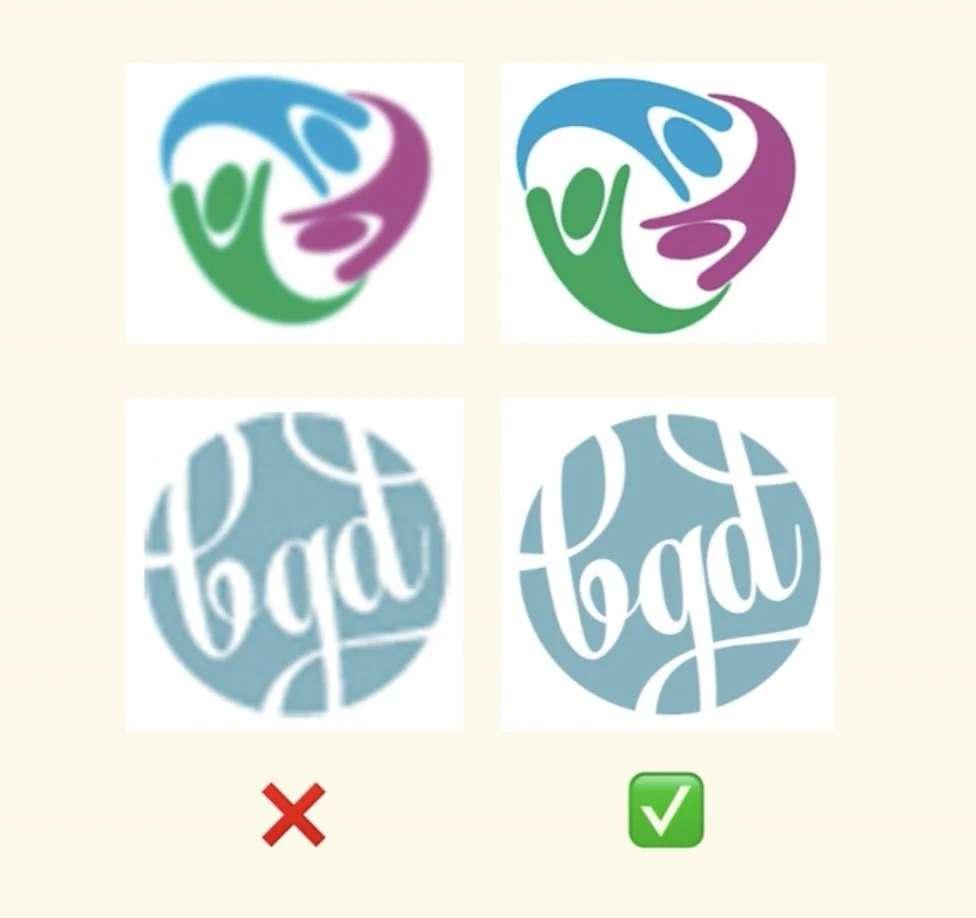
❌ Sign #1: Low resolution logo
If your logo is blurry or looks pixellated when you resize it, print it on business cards, or put it on merchandise, it’s not high resolution. This is a very obvious sign that your logo wasn’t made in a vectorised software like Adobe Illustrator (a software well respected by professional graphic designers).
This is one of these things that many business owners don’t realise they need to have until it’s too late. Their business cards arrived and the logo looks a little ‘fuzzy’ or they printed a pull up banner for an event and the graphics look pixellated (and it wasn’t the printer’s fault)
The bottom line is, your logo is your brand’s first impression, so it better make a good one! And while it’s not “the end of the world”, having a low quality, blurry logo on merchandise or marketing material affects your street cred (and your brand perception). In the long run, we don’t want consumers associating a ‘poor quality logo’ with a ‘poor quality business’.
✅ Solution #1: Make sure you have high resolution (300 dpi), vectorised versions of your logo
This fix is really easy! Make sure you have high resolution, vectorised versions of your logo (in all it’s variations). High resolution means a logo designed (in it’s original form) to at least 300 dpi or 300 ppi. Yes, you can use online “vectorising” tools, however these can distort your logo in small ways, so it’s always best to have the original files. If you’re working with a graphic designer, they should provide you with PNG, EPS/AI, and or PDF files in high resolution.
But what if you don’t have a professional designer helping you and you’re using something like Canva? It’s not a perfect solution but you can make your canva file size larger (for example instead of 300×300 pixels, design your logo on a larger size canvas, such as 2000×2000 pixels (or px)). When you download this file, the quality will be higher.
If you’re using the logo for an even larger scale, you can also design the logo/file in centimetres or millimetres too.
When downloading your file from Canva, avoid compressing the file or flattening the file which can affect the quality of the file/graphics.
❌ Sign #2: Poor colour contrast in your logo
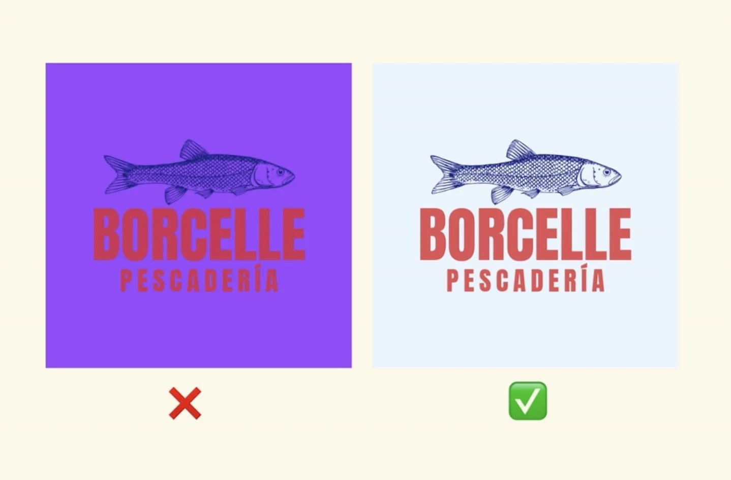
Colours that clash or blend together make your logo hard to read, so it’s best practice to ensure your logo text/graphic colour is significantly darker or lighter than the background colour. This is an easy mistake to make especially when you’re DIY’ing your logo and colour palette because while some colours look pretty on Pinterest, they actually don’t work together in a real world logo design.
Your colour palette should be cohesive, meaning all the colours should work together and not cause eye strain. When it comes to your logo, having a good amount of “colour contrast” isn’t just about making a better design decision. It’s actually incredibly important for accessibility, as low visual contrast makes it difficult for those with visual impairments to see/read your logo.
Visual Contrast Definition: Visual contrast is the difference in colour, brightness, or physical properties that makes one object or element distinct from another or from its background. It helps the human eye separate shapes, read text, and notice important details.
✅ Solution #2: Use this tool to test your logo’s colour contrast
Just because two colours work really well on their own doesn’t automatically mean they will go well together in a logo design.
When it comes to visual contrast, you don’t need to be a professional graphic designer to know if the visual contrast is good or not. There’s actually tool for that! Try using this free online tool to test(and get an actual numerical score) for your logo’s colour contrast. Simply upload your logo, select the background and text colours and you’ll either pass or fail the visual contrast test.
If you don’t pass the test, this means you need to either make one colour lighter or one colour darker (to create more contrast).
❌ Sign #3: Your logo doesn’t work on a small scale / small contexts
What good is having your logo on something if no one can actually see it? Thank goodness we can zoom in on our phones to be able to read things, i.e. tiny logos, but do you really want to add that extra step for your audience, clients, or viewers?
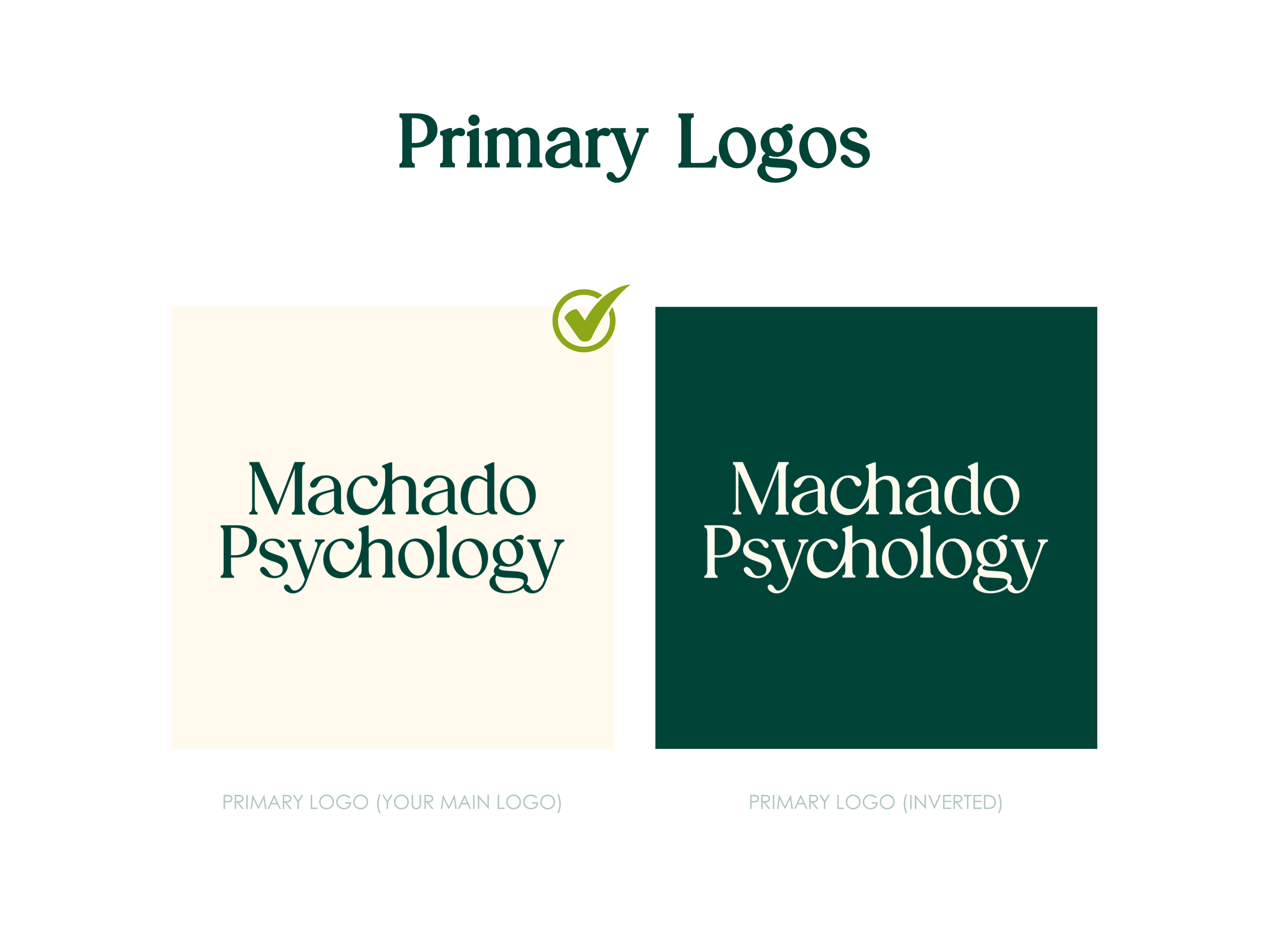
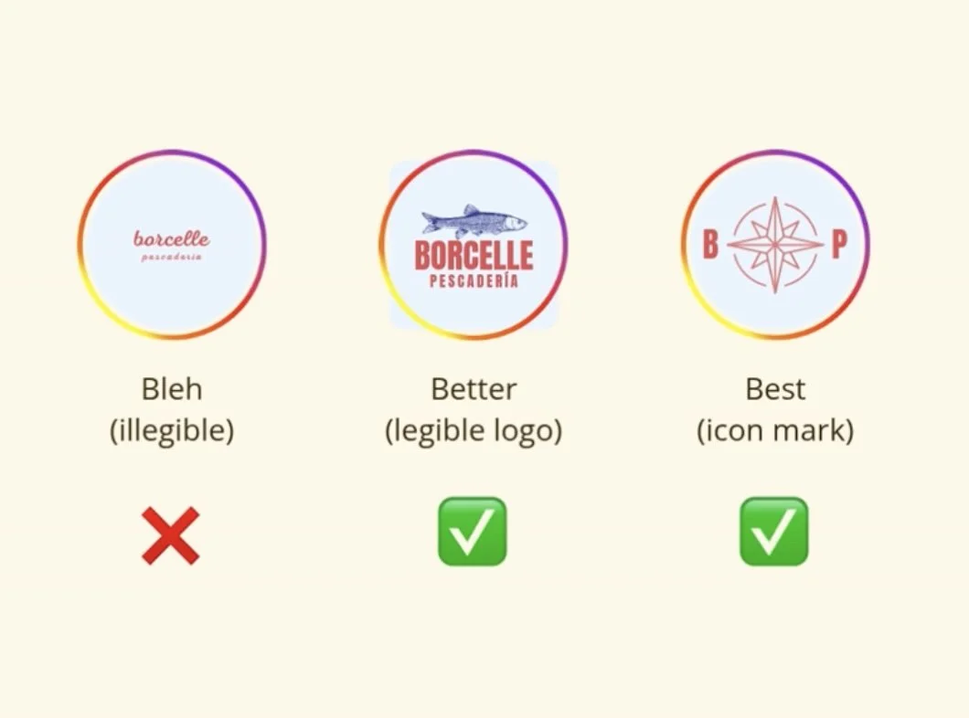
Your logo must be legible when used in smaller contexts, such as as on social media, your website footer and from far away. Often, this is where a logo mark/icon, or a shortened version of your logo will shine.
✅ Solution #3: Make sure your logo can be seen from far away (you might need a shortened/summarised version of your logo i.e. logo mark)
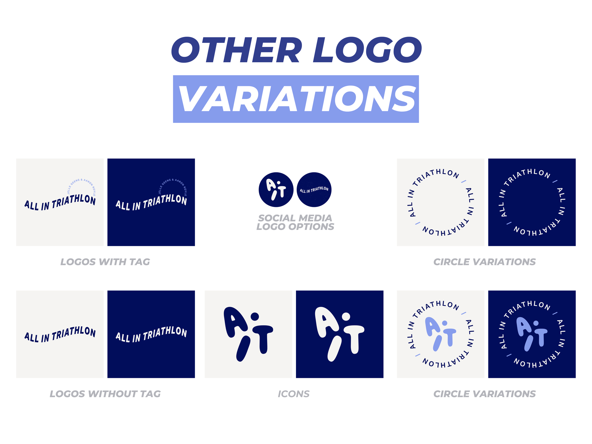
Making sure you can scale your logo down so that it doesn’t lose it’s essence is crucial when designing your logo and this is where having a summarised version (or shortened/condensed/simplified version) comes in. This is called a logo mark or brand icon.
The long term goal is for your customers to remember a symbol, and immediately know this is associated with your brand. Think of the Nike logo, with it’s iconic “tick” brand mark. Or McDonalds with its “golden M arches”. Even by just seeing the ‘M’ by itself while you’re driving along the highway, you know a McDonalds (or Maccas as we like to say in Australia) is just around the corner.
Having a unique symbol, icon, monogram or letter mark that represents your brand in a simplified way is a great stepping stone for creating a visual association between your business and it’s logo. Having a logo mark is also highly practical and can be used in contexts where your full logo might appear too small/illegible or where the full logo may not fit comfortably.
❌ Sign #4: Your logo looks like every other Canva template logo 🥲
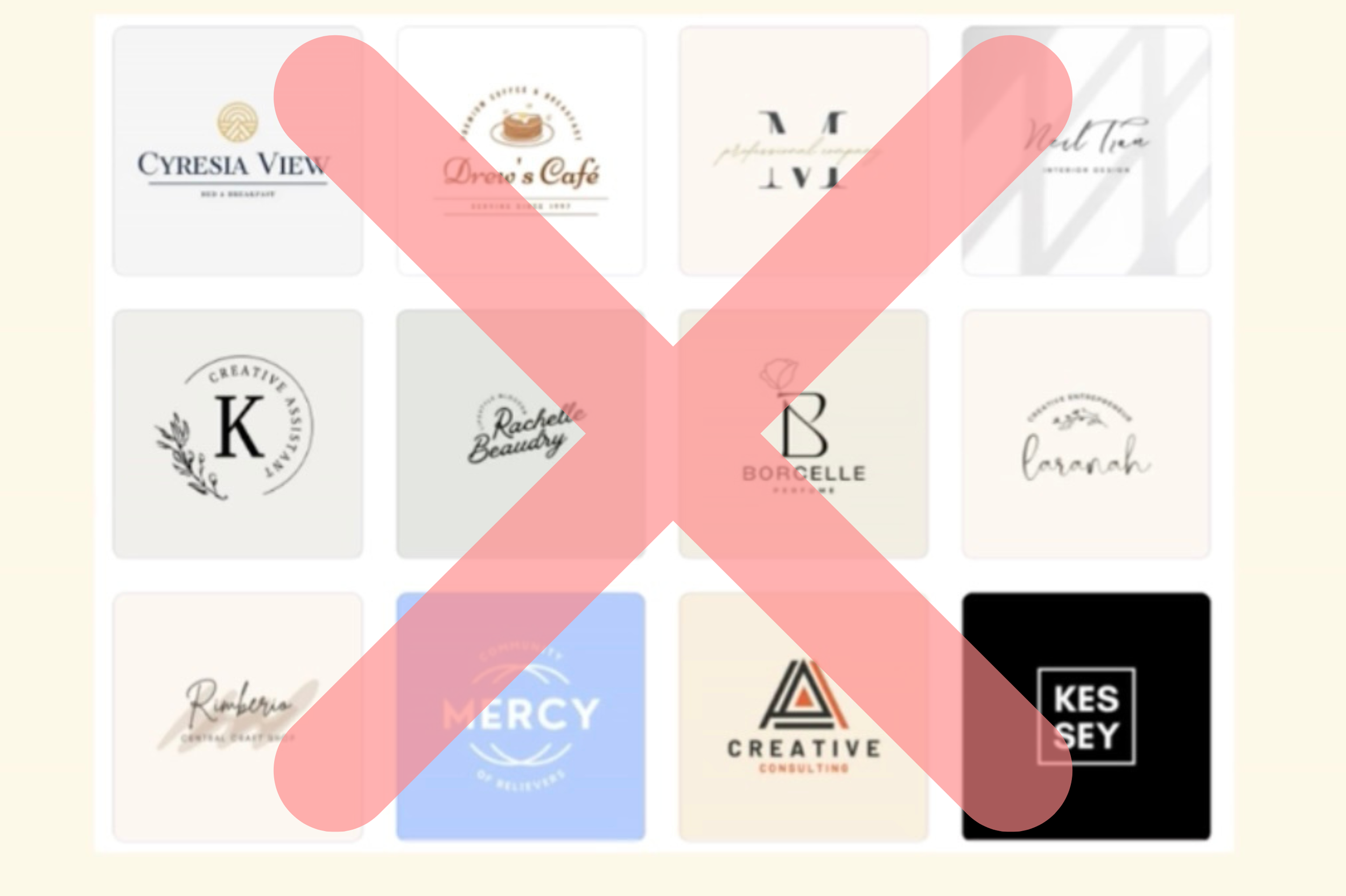
All I see is another generic icon and overused fonts. If someone else could copy your logo in 5 minutes, it’s not helping you stand out. Oh and you can also forget about owning the IP to your logo, that’s Canva’s property. Canva logos are fine as a temporary solution, but aren’t great for building brand recognition in the long run. At some stage, you’ll need to rebrand and this is where a professionally designed logo/brand can help take your business to the next level.
✅ Solution #4: Don’t use a Canva logo as a long-term solution
In this case, the only real solution here would be to have a professional graphic designer help you create something unique for your business. If you’ve ever gotten a new tattoo before and went online to find some inspiration, you might see the same examples over and over. This is partly due to the algorithm magic, and also to AI over-saturating spaces like Pinterest. Things start to look the same and that’s true for logos too.
No matter how you word your description on Canva, you’ll generally see the same materials that everyone else is using. When your business starts gaining traction and it’s time to level up your marketing + branding, this is where a proper designer can truly take your brand to the next level.
❌ Sign #5: Font Issues
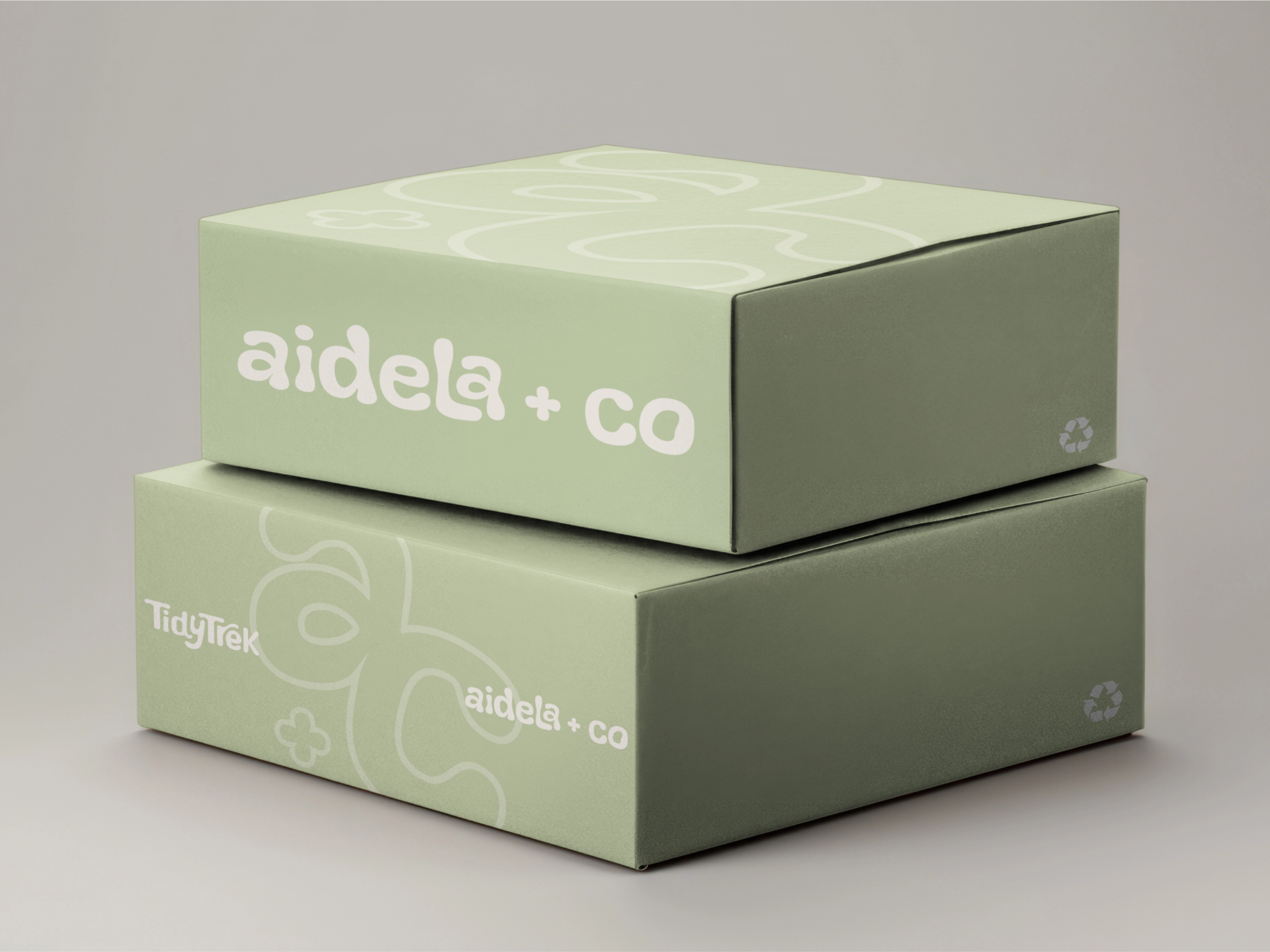
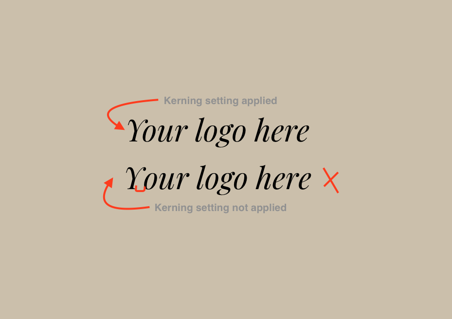
Poor spacing between the letters (kerning) or elements of your logo is a clear sign your logo was DIY’d. A good designer will know how to space all elements for visual balance. Your customers won’t realise exactly what feels off, they’ll just know that something is. But if you are going to DIY your logo, there are a couple of small tricks I recommend for you…
✅ Solution #5: Look at spacing, individual lettering, and the brand mark/icon
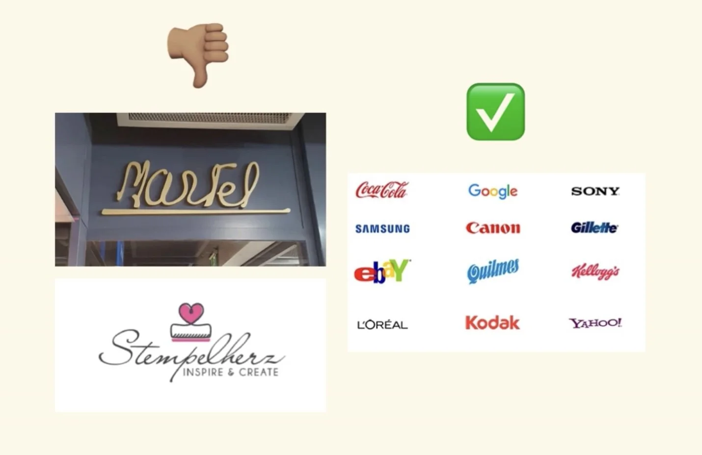
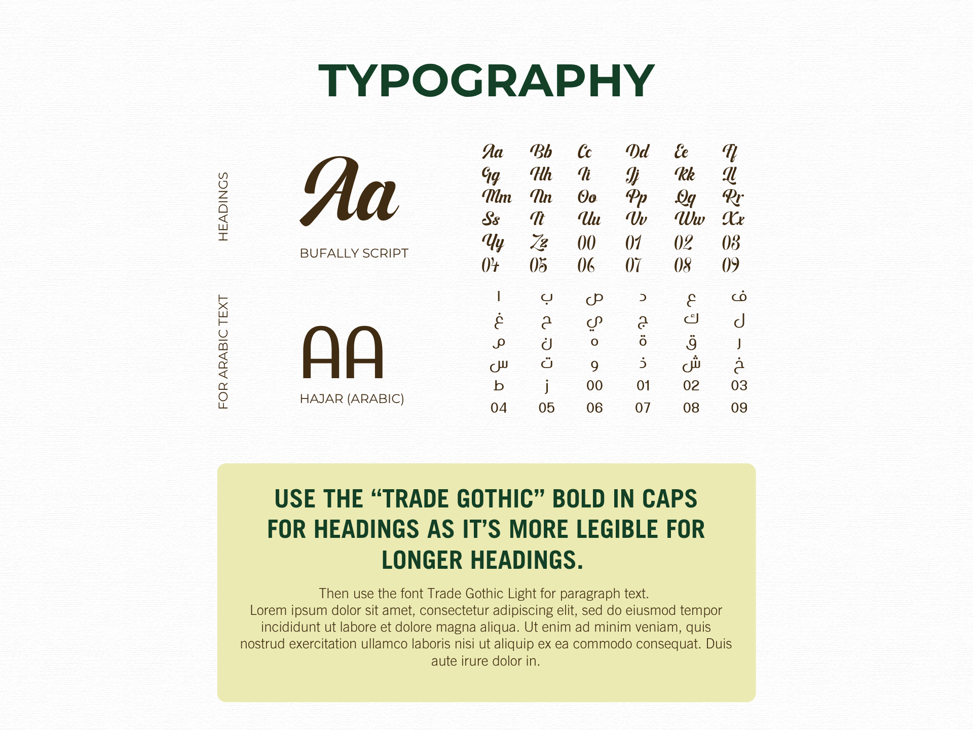
As a general rule of thumb, I recommend avoiding a script or cursive font as your main font. If customers 1) can’t read it, or 2) don’t have 15 seconds to try and decode what it says, then you’ve already lost them. So if you’re not a designer, please avoid using scribbly, illegible script fonts.
Ironically, Coca Cola uses cursive and is one of the most internationally recognised logos of all time! Their logo was also professionally designed, so as with all things in design, these rules can be broken (but only if you’re a designer). So although I typically recommend a non-script font…just be smart about it if you must, then definitely make sure it’s legible/readable.
Again, if you’re creating your own logo, I recommend non-designers to use a maximum of two fonts in your logo design. Sometimes less is actually more, and simpler fonts can have a more impactful effect.
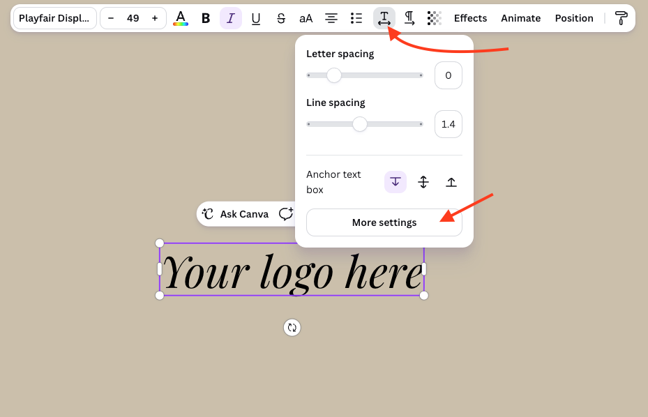
As for spacing in the logo and and kerning, this is something that as a designer, you learn at design school. But also something many of us can see immediately. It’s difficult for a non-designer to apply the most appropriate kerning, however Canva does have a feature under the text editing tool bar in “More settings” which allows you to turn on automatic kerning edits. This reduces the visual spacing between the letters automatically.
❌ Sign #6: Overly-detailed graphics
Complex illustrations may look cool on a screen, but they don’t scale, print well, or read quickly. A brand is more than just one logo. It’s a suite of visuals, colours and graphics. It’s an entire vibe and that’s a lot more than a simple logo in Canva.
Maybe it’s controversial, but in my opinion: a complicated logo = a complicated customer experience.
✅ Solution #6: Simplify, simplify, simplify!!
One of the biggest things that they teach you in design school is this: if your design isn’t working, instead of adding more, try taking away.
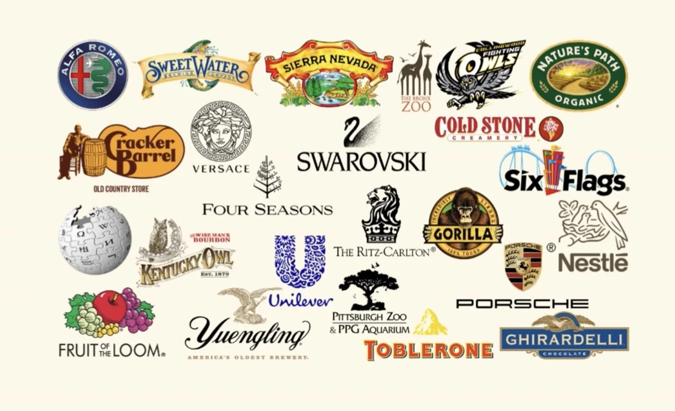
Let’s be honest, some of the logos below are doing TOO MUCH. It feels like they are trying to fit everything about the brand into one tiny logo. To me, what this communicates is chaos, disorganisation, and lack of clarity. Now… if you are a bit of a maximalist and are keen + determined to squeeze it all into a little logo, please do yourself a favour and have variations of your logo with simplified versions.
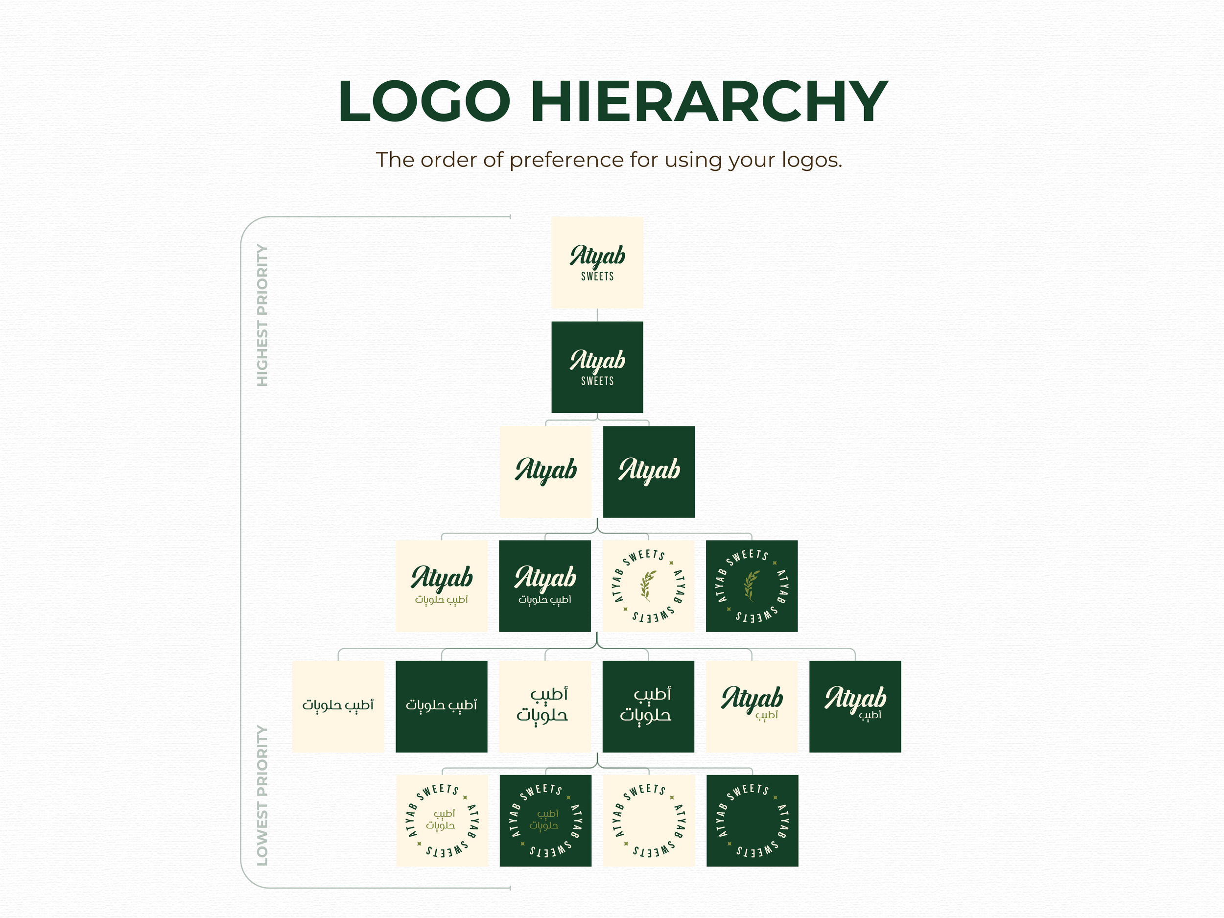
Many people who are unfamiliar with the specifics of designing a brand may not realise that your brand is not just one logo. Your brand (or visual identity) is actually a culmination of visual logos, graphics, colours, fonts and this makes your entire vibe. Each of these elements contribute to your brand and the goal here is for customers to know that if they see just one of these elements, perhaps even just a colour, they immediately recognise your brand.
A great example of this is Cadbury - in fact they’ve even tried to (without success) trademark their iconic ‘purple’ colour. Probably because when consumers are shopping in the supermarket, if they see a purple chocolate bar, they immediate associate it with Cadbury chocolate because that’s the brand colour we know and love! Put simply, we see their purple (Pantone 2685c / 2865c) = we think Cadbury!
Perhaps using an intricate logo suits your website, packaging or social media branding. I’m not saying you can’t have an intricate or maximalist logo. However, having a simplified version or two will give you variety and a clean look option should you need it.
Need help from a professional graphic designer?
If it’s time to level up your brand + logo, I’d love to help make it happen. I’m Kayla, an Aussie freelance marketer and graphic designer based in Spain. I work with clients worldwide and finding creative marketing solutions for businesses is my bread and butter. Book a free intro call to see if we align.